Fred Hutch Branding
Senior UX Designer | 2022-2023
Situation
Fred Hutch is a part of a consortium including Seattle Cancer Center Alliance, University of Washington, and Seattle Children’s. In an effort to further the advancement of cancer care, Fred Hutch and Seattle Cancer Care Alliance merged to join efforts. Employees were happy, hesitant, and hopeful all at the same time when the news was announced internally and reasonably so, just because we were starting something new.
Along with the newness, came a new brand identity. And because of the highly political nature of the merger, an outside creative agency was hired to keep the neutrality. The issue was that the design teams within Fred Hutch and SCCA did not have a proper seat at the table when it came down to design conversations and decisions.
The problem was the over reliance on the external creative agency’s knowledge and the excluding of our internal design teams, made it difficult to rectify current design challenges.
Target
My idea was to present these design challenges and their impact to various leadership in a way that is relatable and digestible.
I felt it was important for us to be involved in the discussions because, with our future brand identity, I wanted to remedy some of the issues our teams had been experiencing working with our current design languages.
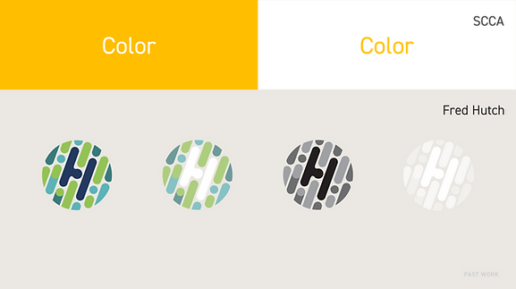
Some examples were that SCCA’s color palette was challenging to work with due to the lack of color contrast and Fred Hutch had a multitude of logo variants, solid and opaque, making it difficult to know when to use which logo.
Approach
I started the conversation with my design director, wondering if I could be part of the conversations. With much persistence, my team and I were finally granted an audience with the VP’s and other decision makers from the various organizations. By then, months had passed and a final logo was already chosen without our input, and from what I could assess and predict, this proposed logo and visual structure would only add to the design difficulties we were already facing. Nevertheless, I was appreciative of the dialoguing opportunity.
I felt passionate about advocating for good design; however, the audience was not made up of designers. From my experience, the best approach to this situation is to find some commonality, something relatable to build a connection so people can understand what you’re trying to convey. So I took time to discuss characteristics of a great logo: simple, appropriate, and memorable.
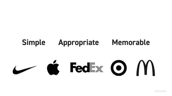
Then, grounded the context by showcasing familiar logos that embodied those characteristics. Transitioning to show the newly proposed logo, I shared concerns that I could now explain in a more understandable way.


The conversation continued with questions like: Is this logo simple or too complex? Can it scale? Are these color combinations meeting accessibility standards? We’ve had challenges with our current logo. Is there an opportunity for the new brand identity to rectify these concerns?
At the end of that productive meeting, leadership thanked me and my team for surfacing these matters, and some even started opening up to one another that they too were thinking the same thing and had been having second thoughts.
Results
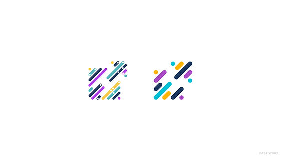
This is a before and after of the final logo mark. I was able to influence the group to simplify the logo making it more usable and functional for us and our users. Soon after, the creative agency delivered their version of the style guide which we are indeed using, but since have evolved.
Our design team reviewed the complicated style guide and found ways to simplify it, keeping within the boundaries of what’s realistically possible with changes and timelines. With the anecdotes and data from our peers and users, I wanted to create a moodboard that reflected Fred Hutch to remind ourselves why we’re doing what we do and who we do it for. This was the foundation of our directional changes.

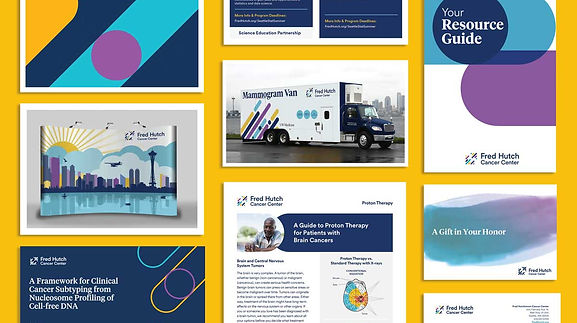
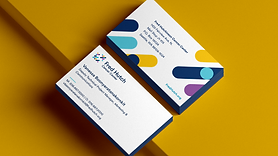
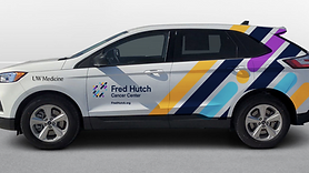
With the eccentric array of colors given to us, I wanted to prioritize the use of the blue/green hues that are so closely related to the feelings and ideas of security and healing. Being in the city of Seattle can be advantageous for us as it evokes this hybrid idea of technology and nature and growth. Though we want others to associate Fred Hutch with state-of-the-art equipment and facilities, our focus is to get you outside of these walls and back to doing what you love with the people you love. Here are some examples of how we’re trying to use this new visual system all while keeping those moodboard ideas in mind. I’ll tell you we didn’t come out with a “perfect” logo and identity but we concluded with a logo that’s simpler and significantly less complicated to work with than what was originally chosen which impacted print documents, signage outside and inside buildings, embroidery on clothes, and a lot more—monetarily equating to millions worth in production costs.